There are many tools like Readability or Evernote Clearly to make any
arbitrary article readable and they are very good at their job.
Sometimes however you do not want to get rid of all of the formatting and
sometimes they simply just do not work, e.g., on web forums.
One thing you can find all over the Internet is pages stretched from side to
side, and they are all but readable on larger screens. Of course with
responsive design you can just resize your browser but that is not what you
want to do all of the time.
Here is a handy bookmarklet that will ‘columnize’ any webpage:
javascript:d=document.getElementsByTagName('body')[0];d.style.width="11in";d.style.margin="0 auto";void(0);
Enjoy
I have updated my biography page. I have added a link to my PRESENCE paper
and citation for the T:CIAIG one.
My sausages are augmented
As I came home, craving for some chowder, I was wondering what to cook. I
wanted to finish some meat from earlier in my fridge but had to make decisions.
Do I cook sausages, or do I grill some bacon?
Finally I have decided to do both.

With a bit of cayenne and cheese you got yourself a good healthy dinner. Oh,
and for vitamins grill it in some pig fat.

By Shaunacy Ferro, Are Angry Legos Harming Our Children?
The paper estimates that on average, there are 75 Lego bricks for every
person on Earth. “We cannot help but wonder how the move from only positive
faces to an increasing number of negative faces impacts how children play,”
the researchers write. “The children that grow up with LEGO today will
remember not only smileys, but also anger and fear in the Minifigures’
faces.”
Another headline, another “no”. I remember painting over the lego faces to give
them any expression I wished them to have. Bad guys were quite angry.
I have started teaching myself some Objective-C which also means that I have to
use something else than my beloved Qt Creator.
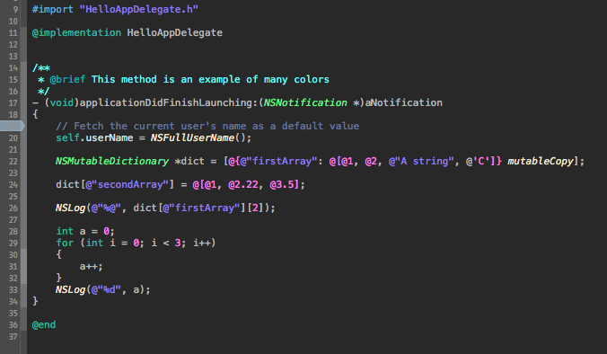
As to feel a bit at home I have ported my Gulf theme over to Xcode. The choice
I have made in creating this theme is to conserve all of the colours from the
original (e.g. Types and Classes are greenish, while attributes are blueish).
Sadly Xcode does not provide different colours for global and local variables.
However, all externally imported classes, types and functions are marked in
italics, so you can easily know what belongs to you.
Here is a quick look at the theme:

And here is the download link, enjoy:
Gulf theme for Xcode
This time I will share a recipe to what is probably the first thing I have
cooked and required more tools than a can opener.
This meal is dead simple and the greatest thing is that you can cook it without
even having any precious condiments, such as salt or oil (but it helps).
Ingredients
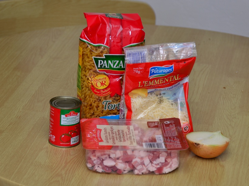
Here are the ingredients you will need. As it is designed to be cheap, there
are very few of them. If you live in France you may notice that everything
comes from Intermarché’s store brands.

- Smoked bacon
- Emmental cheese
- Half an onion
- Tomato sauce (thick)
- Pasta
- Bonus: salt and oil
Cooking
Dice the onions.
For the sauce put some oil (if you have any) to a frying pan, heat it and then
add onions. Stir until they are somewhat cooked (become glass-like). If you are
cooking without oil keep an eye on them and stir a lot so you do not burn them.
Once the onions are good add the bacon. Stir until it becomes opaque. At this
point the bacon will probably release quite a lot of juicy grease. Depending on
how fat you are and want to be you can throw some of the grease away.
After this add a can of the tomato puree. Pro tip: in order to not lose the
precious sauce, pour water into the can and stir. Then pour the tomatoey water
into your sauce, it will make it more smooth.
Cook the pasta.
Nota-bene on cooking pasta (skip if you know how to do it)
For one person use about this much spaghetti:

Step by step guide to edible pasta:
- Boil water
- Put salt to water if you want salted pasta, serves no other purpose
- Put pasta into boiling water
- Wait as many minutes as written on the package and then one more
- If the water spills out of the pan give zero fucks
- Get pasta out, serve immediately
Serving
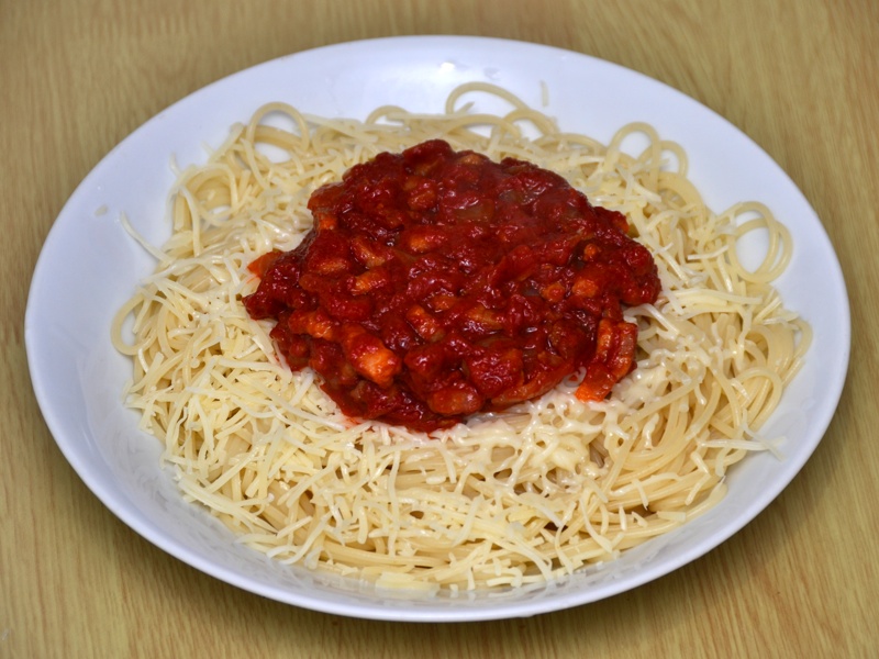
Put the pasta on a plate, cover with cheese. Put the sauce on top.

If you are wondering why my torti from the photo magically transformed to
spaghetti then know that I only had a new pack of torti in the kitchen. Also
this works with any pasta, of course.
Have you ever thought you might be liking too much stuff on Facebook? Have you
ever thought that it might be such an important issue that you need to stop
doing it? And write about it on a popular tech website?
Well, some people have, as written in this article. Seriously, if people
do not have a real problem to cope with they will find one. If we have a job, a
home, and a decent life let us complain about how we must do stuff that did not
even exist a few years ago.
Lend Kendall:
I’ve hit the “like” button thousands of times out of obligation, for worry
that I might hurt someone’s feelings or make them feel ignored.
Really? What kind of obligation do you have to random people on the Internet?
Luckily Facebook does not have (yet) a feature showing you who read your posts
like they have for chat.
I got finally fed up with the Unity-like checkboxes on my favourite TV-show
tracking site. Quick roundup: these checkboxes are represented by a box
with a grey checkmark when unchecked and a box with green checkmark when
checked.
Not only is this horrible for colorblind people, it also drives sane persons
nuts.
If you use Stylish extension for firefox, or some alternative for your browser
then you can use this snippet to replace them with standard controls:
@namespace url(http://www.w3.org/1999/xhtml);

@-moz-document url-prefix("http://www.pogdesign.co.uk/cat") {

 .lists div label, .day .ep label, .today .ep label  {
   /* bright background */
   background-image: url('data:image/png;base64,iVBORw0KGgoAAAANSUhEUgAAAAsAAAAsCAYAAACzBUKoAAABJElEQVQ4je2TscqDQBCEZyWPFiFgYymWKXyGvEEsfISAvdilFCEEJEXeIU0KO0vhlttcqpOY8POvRboMHNcMyzAfQ6fTyQVBAP+IaPqJCDM1TeOg0PV6dYExRuOFiCBgZpXZWgv1ZWZeaNbGWGQ2xiw0W2vVMWi/3ztP65XeK1X/VuM4Qo17t9upcOd5/j/uLMscoMC93W7d4/EA8IY7iqJZnDRNnbUWIjK1MZmNMdhsNg4A4jh2zAxmRlmW5M0rH4OZISIIw9AZYyAiqOt6qmOG+3w+k7/GzDgej7PePnB3XUfMjLZt3wr+A/flcvkw+hi0Xq/VuOl+v+vXfbvdVLiHYfite9KX111VlX7dfd/r110UhQr34XD4rXvSl9edJIka9xPBTXfNN90QEQAAAABJRU5ErkJggg==') !important;

   /* dark background */
   /* background-image: url('data:image/png;base64,iVBORw0KGgoAAAANSUhEUgAAAAsAAAAsCAYAAACzBUKoAAABJ0lEQVQ4je2TsY2FMBAF1+g6oAJSEpqgCEqhAwgogQpogYScyBkRBA6IIETyCuMfLQLj01+Cy86ShVYeW0+Mnui6zgZBALSFEOdXCAG31batBcbq+94GWmsOC8YYCBCRBe/7DuyXEfElzI3xCtZav4T3fWfHEEVRWLJ1tXe1Svtn2zZg687znKW7LMvvupdlsQAM3QQCOLqvB775oZuAKxiGoThhN4YPfMDXA9/80E2AC56wq9sHUgyRpilbt1BK8ds9jiNL97qu/+0+1x+3u2kafrvneea3u6oqlu66rr/rVkrx2j1Nkz2OAwAc3VLKW5xhGKwxBgh+6KYLUkqLiICIEEXR7+2mC9ZaiOPY3+4kSW7/yZ0fuglwwRN2dftAiiGyLGPr/gDD7TWBmCHgngAAAABJRU5ErkJggg==') !important; */

 }
}
If you use a dark background then un-comment the second background-image tag.
Enjoy
With the iPhone 5S release approaching feature wish lists and redesigns of iOS7
are legion on the Interwebz. Undoubtedly many people find that iOS in its
current state lacks features, looks old and boring, and more generally “has to
catch up with the competition”.
Usually the argument goes in the lines of “the home screen is just a list of
icons” or “Apple must put widgets on the screen” or even “iPhone should
centered around people, not apps”. Many proposed changes poke around the lock
screen, many of them add a lot of eye candy, most of them are just wishful
thinking.
It seems that lot of designers want to be part of the apple experience, want to
show their skill by “improving” the user experience of an applauded product.
The problem is that they base their designs on opinions of a minority (albeit
very vocal) of geeks and tech enthusiasts. They criticize Apple’s design
decisions without looking at the reason behind them.
Let us look at some examples and see what’s wrong with them:
Case: the iOS7 redesign video
A few days ago Federico Bianco has published a video of his ideas of how iOS 7
should look like. General reception, if we take comments on forums such as
Mac Rumors, was positive. But it these comments were several very good remarks.
Lock screen
The first thing that comes in mind after seeing all of those lock screen
features is security. Judging from several security holes that have surfaced in
the past months it is apparent that the less features the lock screen has, the
better. In its current state it can display time, notifications (that you have
chosen to appear there), let you call emergency numbers and take a picture. For
any other action you need to type in your passcode. Now, of course not all
people use the passcode protection but most people do and it is a good practice
that should not be discouraged.
After the redesign one can reply to texts, call arbitrary numbers, switch off
wifi and my personal favorite: put the phone into airplane mode. What a joy
when some random bloke can cut your phone off as a prank whenever you leave
your phone out of sight for a minute. Apple has put a lot of effort so that
without passcode people can not access even your photos and this dude lets
everybody happily use your call minutes.
The widgets Mr. Bianco proposes are a nice touch, in theory the allow you to
peek at some of the information the application provides and in some cases take
some rudimentary action. In practice the implementation is quite poor.
One very important thing to consider when using the double tap/click is the
action that happens when the user is too slow. For example if we consider the
selection on iOS then if the double tap is too slow one would move the cursor
with the first tap and open the selection menu with the second. Once there one
can select the word with a single additional tap.
In the case of double tap opening widgets, a wrong gesture would open the app.
No big problem as you can get the information from inside the app as well as
from the widget, as long as it does not take too long to open which would be a
major frustration. Instead of earning half a second you would lose two.
The one thing I do not get with all these on-screen widgets is their utility.
Why would I throw out place for apps to put some random information instead?
What is the point of putting them on the main screen when in order to access it
you need to close your current app?
Apple does already have a perfect place for widgets, the only missing thing is
opening the API. You have guessed it: the notification center. The NC is the
best place to put all kinds of widgets for several reasons:
- It is already there
- It is accessible from everywhere
- People are already familiar with it
- Jailbreak community has already shown that it works
If Apple would open the API then a lot of people would be happy.
Settings drawer
Another active corner = another hidden feature. There is clearly a huge demand
for quicker access to settings. However I would see this more either as a
widget (made by Apple, there is not much hope that apps will ever get access to
phone settings) or inside the app switcher alongside music controls.
Mission control
Task switching was remade by a great ton of designers such as here in this
video. Some of them are already available for the jailbreak community, like
the much appraised Auxo.
The common point of all of this switchers are snapshots or live previews of the
applications. In the case of Auxo they are completely useless as they are
hardly twice as big as the app icon. The icon itself is shrunk. It is beyond me
how somebody thinks this is a good idea. A snapshot preview consumes
considerably more memory than an icon and it is much harder to quickly
recognize.
As for live previews, they bring up the problem of real multitasking. Although
background running apps could, in theory, provide a live preview, for most of
them that would be impossible. Simply because the background process is not the
same and the renderer for the application does not run and should not run
because of performance issues.
The shelf
This is the best idea in the video in my opinion. The major issue I have with
it is the fact that it sits on your dashboard as a folder. The news stand like
shelf can only show 3 files on the iPhone at the same time, which is really not
enough if you consider the quantity of the files that would end up there.
I really like the idea of system-wide file repository, as long as it is
organized by type and searchable and not in a folder-like structure.
Case closed
Well, my rant is finished. It was largely based on comments and articles I read
previously such as the piece on Unsolicited redesigns. Of course
redesigning something is a boatload of fun, however it would be nice if people
first asked themselves “why” has the original author done it one way or another
before trying to improve on it.
Pages is a quite nice word processor even though has several quite
stupid anti features (such as the page being stuck to the top-left
corner). Nevertheless it is currently my tool of choice when I need a
document with more than headers, lists and bold text, for which I would
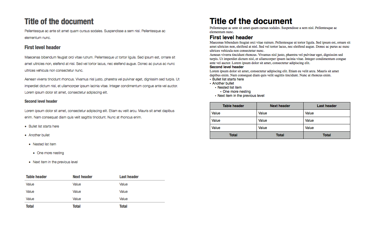
of course choose markdown. I have created my own default template, which
you can of course download right here. In the zip file you will also
find a document explaining all of the features of this template. You can
see how it compares to the default style on this image:

Download the zip package containing the theme here:
Elegant as Clockwork v1
To install it, put it into ~/Library/Application Support/iWork/Pages/Templates/My Templates


